If you're an Adobe virgin and/or are just adament about your work having your signature look and feel - I'm right there with you! There's something that just screams authenticity and personality from each pencil line, each brush stroke, and each little accent of colour. After all, when you're flicking through a designer's sketches, it's the scribbly pencil ones we pay more attention to. Perhaps it's the fact that it feels more personal, as though we are looking at an intimate piece of work.
However, if you haven't already, you will at some point be asked to render your work (this, of course, would apply to those of you who are currently on a fashion course or are planning to be). It's very likely that one of these Adobe programs will be suggested to you - the most obvious choice being Photoshop and Illustrator.If you're anything like me, you will try/have tried to put it off for as long as you possibly could. And that's fine, although to get out of the little box you conformed into, and to show any visible improvement in your hand-drawn work, you will have to use a little - maybe a lot, of technical rendering.
Now, looking at my work I would definately recommend the use of Photoshop and Illustrator (at least!) and if you're still feeling somewhat reserved towards them you could always start off with the simplest steps...
1) After having hand-drawn/painted a piece, try scanning it in and rendering it a little bit - nothing too drastic, just a play around on the brightness, contrast and saturation. You'll notice how much more visually striking the colours can become. Sometimes just the slightest alteration can change your objects to look like something entirely different, other times they might just blend into the whiteness of the page, and if altered enough, it can often have a completely different effect - it might be the same object that you started out with, but the alteration of colour managed to change the tone.
2) If you're a little more confident, try using an image that you've scanned in and see what you can do. Try manipulating the shape, or replicating it or reflecting the object. try using the option to copy and paste and go wild!
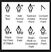
 3) Perhaps you've got a little more time and willingness to learn, perhaps try scanning the image of a hand drawn garment and scan that in. Open it up on Illustrator and change the opacity to about 40-70% (this is only so you can differentiate between the hand drawn lines and the new, bloder lines of the pen tool). Using the 'pen' tool, try and recreate the lines of the image you have scanned in . Try and adjust the thickness and colour to fit your image, Soon you'll find that you've got a perfect outline!


No comments:
Post a Comment