Being a student on a course that requires 100% of its marking from coursework means having to do a lot of work which, needless to say, usually requires:
A) High caffeine tolerance
B) Sleepless nights
C) Dedication which can only result in aching hands and bloodshot eyes.
Being a student on a fashion course, however, is a little different...and in addition to the above you will need:
A) An insane collection of fashion magazines
B) An endless supply of drawing equipment/painting materials/fabric and trims
C) High tolerance for people constantly calling you thick (whether that's directly or simply implied or just assumed - that's irrelevant)
Being a fashion student, I found that even in my new flat, I have accumulated a few too many Vogues than the tiny space allows. Whilst debating to myself whether or not to keep the magazines, I began to flick through them in an attempt to help me decide.
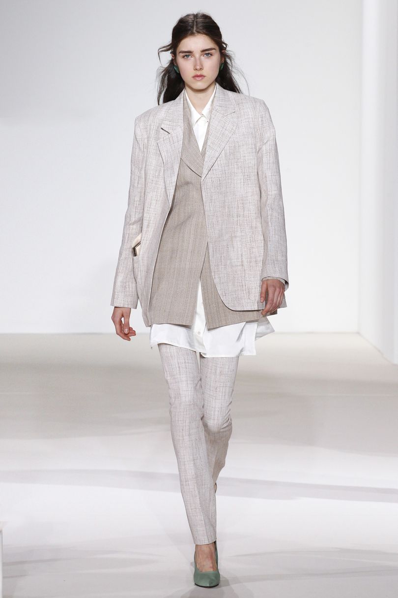
One model in particular caught my eye as she popped up in quite a few campaigns - everything from Versace to Miu Miu to Mulberry. And what absolutely just attracted me to her was her beautifully unusual face - something which, today I think would be more common in beauty shots rather than anything else. And as though to apply emphasis on that, she has also appeared in the Voguebeauty section of the magazine.
I recall first seeing this model in a youtube make-up tutorial by
Lisa Eldridge - a video from 2011 and I had just fallen in love with her face from then on. So with that and the dilemma of what to do with my old Vogues, I decided that I would do something useful. And in order to prove to myself that the fashion magazines still deserved the shrine they held in my newly rented room, I would create inspiration boards (as shown in the photograph above) that would - as the name suggests - inspire me to create more adequate pieces of work.
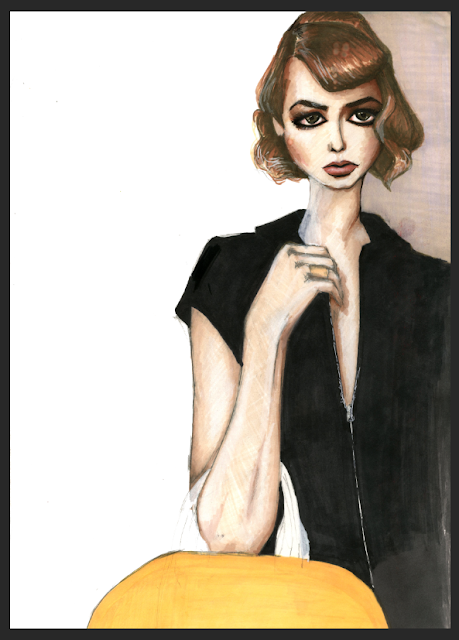
I don't know about anyone else but before unleashing myself in a project like this, I always like to 'test the waters' - usually preferring to start small...hence the pencil drawing (image on the right hand side). I realise this may sound silly as the word 'project' may be being used too loosely considering I had originally set this task up for myself. However, I always find that for me, to ease into new media or new styles, I always have to treat a project as though I want to be able to use as many different media as I can, create different styles and looks and feels and experiment with every variant possible to ensure that I can perform at my best.

This drawing (as shown on the image above) has become one of my most preferred method of illustration. I have found that as I begin to work more with coloured/toned paper that I am growing more and more confident with it, and even - dare I say it - increasingly better. As a child, you're expected to learn to draw by using lines. Growing up, you realise that the lines you have been drawing for a decade or so, were merely representations of shadows, hence the combination of HB pencils and white paper. Only when you're fully emerged into the world of art do you ever begin to give a crap about the negative space in a piece of work.
I had always considered myself a dedicated Art student, however, I have to admit that even to this day, portraying light in a painting/drawing is one of the hardest things to do. Especially when all you're given is a dark canvas and white media. Even thought I hesitate to admit, the idea of that is scary enough and that box shall remain empty in my tick-list for a long time, but is one that I hope to cross off some day.
All things aside, I do think that I did a pretty bad job with the proportions considering I had used a grid for measurements. However, as a stand-alone image, I don't think it's all that bad. I think the use of the strong contrast works well; I like the look of the subtle hints of colour - particularly in the eyes and mouth and I do like the way the light has been captured in a way to create a dewy and healthy look on the skin.
In comparison to all the other pieces in this post, (so far and yet to come), this was one of the quickest, free-est form of mark-making for me (image shown above). To emphasise that point alone, I'd like to point out that, this piece was done on the cardboard backing of an old sketchbook. And from that experience, next time I decide to use cardboard scraps, I think I would stick to mediums such as paint and inks rather than promarkers as it is absolute hell to blend.
And even though, (as mentioned in my old posts), I have been trying to steer away from cartoon-like illustrations, I feel like it turned out quite differently compared to anything else I have done previously. I feel this piece may just give this long, arguably boring post (that I am currently typing up), an element of fun and that pop of life it needs to make it somewhat enjoyable.
This painting (shown on the images on the right and below) is one of the pieces I am still content with. Usually I find that if I am happy with an illustration after having completed it, it will take me a week or two to gather up a list of improvements that could have been made...which in return voids my entire sense of achievement. However, a couple of weeks have passed now and I find that, although I have my list of possible improvements and mistakes, I am also still happy with what I produced.
Needless to say my Vogues are still intact and still remain on their shrine and I have yet to find a reason to stop clinging on to them. It's absolutely amazing how images from collections from seasons and years ago - from names you had never even heard of or just completely forgot about - provided they are good enough - and strong enough, never fail to generate ideas and provide inspirations.


